
|
 |


2010 Site Transformation I'm transitioning early to the 2010 layout. The details are as follows: Concerning my motivations for the transition; mainly I just like to mess around with the site design, that's been a big part of neotoy.tripod since the very beginning, TBH it's my aesthetic. Other reasons include: Modifying the design to more accurately reflect my current objectives for the site. Namely, to communicate clearly "neotoy" as a coherent and independent design concept rather than a deeply personal and abstract ideology. As for the layout itself, my objectives are pretty straightforward: Interactivity: The 'web' in general is obviously evolving into a fully interactive medium. While I'm uncertain as to how long this is going to take, or what it means for humanity as a whole, the process is very intriguing. I want to be part of this movement, if only for the opportunity to increase my understanding of the phenomenon. In response I've added a few features that allow visitors to experience a greater level of interactivity not only with the site, but with each other as well. Accessibility: Friction kills activity. We all know how difficult it is to inspire random people to do anything outside of their own information sphere on the modern internet. Attention spans are constantly shrinking, sensationalism breeds apathy, nihilism, and a generation of 'users' who are either too jaded to care, or too frenetic to focus their energy in a productive manner. In the end all you can do is make it as easy as possible for everyone to access your content and hope that it speaks for itself. Keeping this in mind, the new layout is similar to an RSS reader, giving visitors more control over what they view, without sacrificing volume. Fixes & Styling: The former date code was a disaster, I decided to scrap my experimental attempts and just stick with something a bit more standardized. I've reverted to an unrestricted column width. For some people this might seem like a step backwards, but there's little data linking newspaper or magazine formatting with electronic document usability. I've combined contemporary and classical ideals, in both code and "look". Nothing is inherently new, aside from the unique amalgamation of techniques that comprise the new model. All core graphics are now .png format. I'm pretty much done with jpeg. Transparency is the new black. I've simplified the all inclusive color scheme, including the interactive elements, to a far more standardized state. Some of the choices were based on data, others were adopted via so-called industry standards i.e. "best practices". I've gone through all the code line by line and removed any unnecessary or excessive elements. Streamlining and refining everything for as many platforms and browsers as possible. One major problem with the previous layout was that it was too dark to print from directly. The lighter, more flexible layout makes it possible to print pages easier and more economically. And that's about it, thanks for reading, and hopefully you will enjoy using the new layout as much as I did designing it!  

RSS feed, Site Beta v0.3, Dreams The first, and probably most significant piece of news is that I've finally caught up with the 21st century and added an RSS feed to the site. Meanwhile RSS is quickly loosing relevance due to web 2.0 services like Twitter. Oh well, better late than never. No, I am not on Twitter, no I do not intend to use Twitter. I might as well wait for Google 
Second piece of news, I've decided to give the beta site transformation its very own easy-to-remember permanent sub-domain: https://neotoy.tripod.com/beta/ - So now it's possible for visitors to monitor and provide feedback on the evolving design as it takes shape. Please check it out, and use the comment section at the bottom of this page, if you have any suggestions. This URL will also be used for all future beta revisions to the site. I will post a note to the main page and RSS as new versions are made available. For those who have already examined the alpha transformation, you'll probably notice that I've changed course since the last revision. This is mainly due to a desire to place overall usability and functionality above "image" in my list of global priorities. As Google has demonstrated consistently, style is no substitute for superior design. 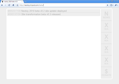
The more I learn about advanced web architecture the less I like it. CSS, JavaScript, XML, all are eccentric half-baked attempts to fulfill essential next-generation objectives. However, none of these platforms alone are capable of doing everything that needs to be done. The result is a rat's nest of syntax, that incidentally renders or even operates differently depending on which browser is being used. This kind of architecture can't endure, and will eventually collapse under the weight of its own complexity. I wish I had a solution, but it seems analogous to civilization. People need to come to an accord on these things, but they never do, they just keep ploughing along, refusing to cooperate, to the detriment of all. Guess it's better than fascism. Occasionally I have unusually vivid dreams, over the years I've observed that these particular dreams fall into one or a combination of the following three categories: 1) Collapse of Civilization / Postapocalypse 2) Advanced or Alien Technology 3) Paranormal / Extradimensional Additionally these dreams tend to be related in some way to the neotoy continuum; I often draw inspiration, incorporate, or let these dreams influence my thought process in various ways. The one I had the other night falls into the second category. I only mention it here because it was clearly related to neotoy. 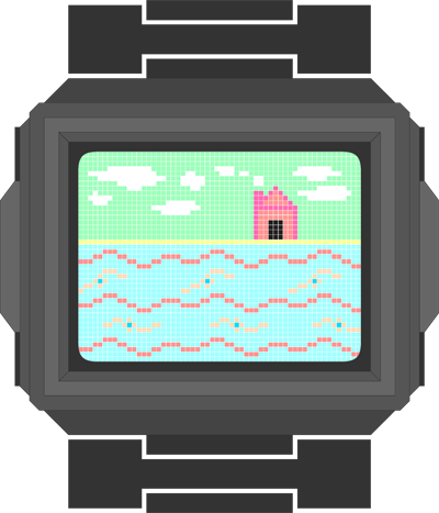
It was a dream about a futuristic watch. Now as most technocrats will be aware, every year watch sales decline; this is because increasingly people are buying mobile phones, which all include a clock, these phones in turn have come to replace the watch as the primary timekeeping device. From my point of view, this does not imply that watches are well on their way to obsolescence, rather basic watch technology hasn't evolved since the early 1980s, and is therefore a prime candidate for a revolution in design and utility. True, this revolution may never come, but that doesn't mean there isn't a lot of opportunity and potential for the platform. Many attempts at advancing the functionality of the ordinary wrist watch have been attempted; from calculator watches, to wrist phones, to strap on TV, even Internet enabled watches, etc. All of these were interesting experiments, none of which really took off. I think this is because all of these devices were inherently impractical; more importantly they failed to understand a sophisticated market. That doesn't mean that technologically advanced watches are a stupid idea. Far from it. The key lies in accepting the undeniable limitations of the form factor. Idealized wrist watches are small and light. This isn't just a variable aspect of the design, it is a crucial characteristic that can't be ignored. No killer functionality is ever going to make an over-sized watch mass marketable. Probably the main challenge with advanced watch design is energy consumption. Things like full color displays, touch-screens and networking consume a lot of power and therefore require large batteries. Clearly watch design cannot sufficiently advance until this challenge is met. The second challenge is the interface, because of the size a lot of creativity is necessary. Polymer batteries and Nanoantennas will probably solve the power issue. Once that is out of the way, the question remains: What real value could such a device provide, given the ubiquity of apparently competing devices. Obviously the watch of the future will have to provide features that you just wouldn't find in things like netbooks, media players, or mobile phones. So while we're reinventing the watch, what are a few things that might fall into this category? Looking at it in an entirely different way, perhaps the watch should be reimagined as something frivolous rather than useful. For example, as a sensor laden aesthetic platform that could display procedural imagery derived from ambient data. As an interactive device. Assuming that a universal and interoperable wireless protocol exists, the watch could interact with surrounding devices, perhaps exchanging information, or filter personalized results to public kiosks. The core idea is that for something that you wear on your wrist for extended periods of time, it should not be passive, nor intrusive, but rather perpetually valuable. 

The update that was not an update So I've been all but useless lately, sorry 'bout that. Incidentally I've been very busy, working on several long-term projects all at the same time. Here's the executive summary: Neotoy - duh! Always working on this one. Specifically a really tricky entry outlining a very sophisticated mathematical method for precision orienteering within a million unit metto. Trust me, it's a lot cooler than it sounds. The downside is that it's going very slow, I don't enjoy math much. 
Teh Internets - in preparation for the traditional and perennial reinvention of neotoy.tripod, I've been messing around with some advanced site transformations, some permutation of which will be slated for a 2010 rollout. You can see a semi-functional, very crude preview here. (1920 x 1200) resolution only. Oh, the irony. 
Philosophy - also working on abstract "Prioritized (optimized) Tactics for Site Design (Design = Qualitative Linear art X Linear utility Y) Superiority". Clearly I like to hear myself talk, lol. Basically this is a bleeding-edge guide for truly next-gen site design. Sorry I can't share just yet.. it's still all theoretical, and I'm trying more for the empirical these days. Excerpt: Answers like "Buttons conform to text, text is X linear." Are not really convincing. Obviously there is a balance between form factor and interface constraints. However, simple tricks like proximity detection and dynamic scale adjustment, undermine such arguments. There is literally no excuse for an inflexible interface. Life - the so-called downturn is touching everyone I know, including myself. I might say something stoic and European, like "These are hard times." But TBH, these are not hard times. As an American I have no idea what that phrase even means. Not yet anyway. Meanwhile morale is at an all time low, and that's just how it is. 
SL - selling stuff that doesn't even exist. My eternal love-hate relationship with Second Life endures. Just as an experiment I listed some of my virtual creations for sale on Xstreet. So far I've made about $2, and yes that's real money. My feelings about this are analogous to my feelings about twitter. You don't need 140 characters to say "We are soooooo fucked.". 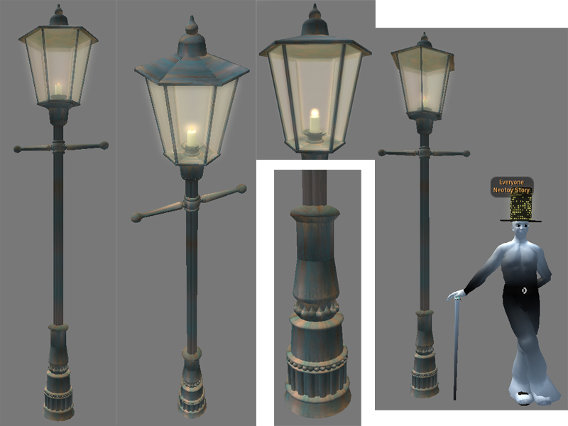
My advice: Smoke 'em while you got 'em. 
My Windows 7 Wallpaper, a.k.a. Desktop Background 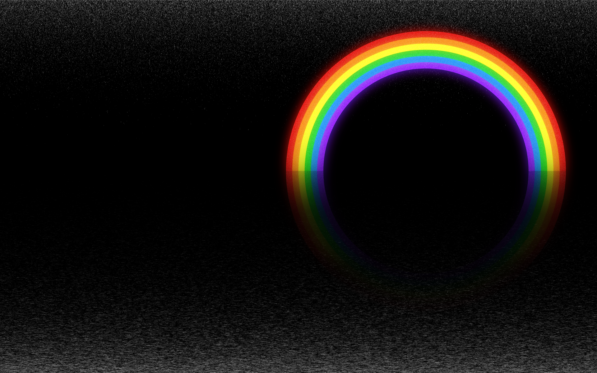
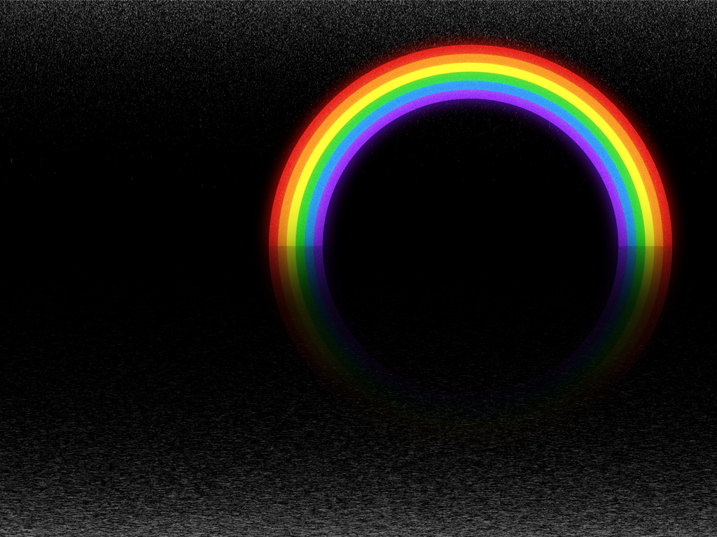
Yo, neo here, I'm trying out Windows 7 Evaluation copy. Build 7100. As part of stress-testing my new system I created this dark but colorful wallpaper using a combination of Adobe Illustrator and Photoshop CS3. I'm pleased with the effect, which is exclusively the product of a few strategically placed filters. Even with 5 layers at over 11000 pixels in width, my new processor chomped through the various modifications practically in realtime. I'm providing two versions of the wallpaper for download. Click on the thumbnails for the full resolution versions (which are without the specification text of course). Oh, and BTW the use of a rainbow in this artwork is not some kind of sociopolitical statement; rainbows existed long before the first homosapien marveled at their iridescent elegance, and they will no doubt continue to grace the heavens long after the human race has faded from the memory of the universe. 

New Computer!! Just a really quick personal update, I'm getting a new computer! Or more accurately, I'm building a new computer. You can see the core specifications here. I've only bothered to list the 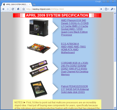
feel free to leave a message in the comment section telling me how I totally got ripped off, and could have saved 100s if only I'd shopped at www.*****.com, lol. Anyway, I'm really excited about this since my current workstation is over 5 years old, and is about as agile as it is energy efficient. This new system will provide a much needed boost to a good percentage of my neotoy related projects, and it should play the latest games pretty damn well too!
Indestructible Added and updated entry for geosphere, an overview of the planetary level infrastructure that is the structural foundation for the rest of the city. This is sort of a 'special' entry because I used it as a model to test out my latest modifications to the main schema (which has also been updated slightly). One new feature, the "Notes" section is highly experimental and hasn't even been added to my cmap template items yet. In terms of the other elements of the entry, this one is somewhat idealized because it just happened to have the right number of revisions completed that it was able to take advantage of my atypical "version fade" revision system. It kind-of works :) -- That's the price you pay for being innovative, it doesn't always turn out like you planned. The real question is: Are the results good or bad? Also, does it make communication harder or easier. In the case of my design, the answer is both. Which basically means, at least with my loose interpretation, that it's not perfected. Which of course, it never will be. -- If you've seen this image before, you are truly: 
Some general notes: I've gone to the trouble of creating an advanced cmap ENTRY-TEMPLATE for personal use, which should expedite my workflow a little. In addition to improved formatting, this new and more comprehensive template includes Google Analytics code, so that I can finally track site statistics as a whole. I'd put this off for a long time, primarily because neotoy has always been a personal project, and I wasn't really interested in following reader metrics; but now that it's so easy to implement (and I really admire Google's application acumen), I've decided to try it. A little bit of trivia: In the murky and disillusioned past, this main index page actually had a hit counter provided by now defunct fastcounter, which I discontinued using sometime in 2002, after topping 30,000 page views. Given the current stats, it's nice to see that I haven't lost all my readers/viewers over the years, considering that things got pretty chaotic (to put it mildly) around here on several occasions, and I did temporarily 'close' the site at least three times during its rather rocky history. Sincerely, thank you for taking part in the neotoy experiment. Moving forward, I've added a couple of entries that use the new template, unfortunately they contain mostly recycled material extracted from my December 2006 timeline. Of course it's unavoidable that I post a certain percentage of old content.. hopefully I'll get around to revising these entries relatively quickly, since they are extremely speculative in light of the more recent additions. 
Neometry I've discovered something interesting while working on the various entries for the connectivity map. Initially I feel overwhelmed by the volume and frequency of rough ideas that revolve around the core concept, yet as I refine the key elements of the design, I find my creative options diminishing very rapidly, to the point where I am basically forcing myself down an extremely narrow intellectual channel. I'm assuming that this is just a normal side-effect of designing a universe class system. Everything is interconnected, naturally this fact equates to tangible restrictions on one's creative liberty. That being said, I'm once again compelled to question my commitment to the project. It can be difficult mixing virtually unlimited creative latitude with the implied condition that as the continuum expands and cools, my ability to change things with impunity will be subject to an arduous inverse proportionality. We'll see. Added an entry for the unit including an explanatory image that took a lot longer that I would have liked. Note: this is my first 'figure' (design illustration) to implement my most recent language-based graphic communication observations. 

Visual Method 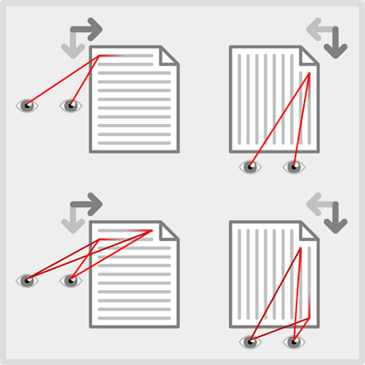
Preview of some artwork from a language related project that I'm working on, just wanted to share. Basically depicts the visual methods used to interpret Western and Eastern style written languages.
Pattern Language I updated a few CMAP entries, although I kind-of cheated since most of the work was already done way back in 2007. As luck would have it, these 'lexicon' items were atypically refined in comparison to most of my archived neotoy notes. At any rate these are key entires that are absolutely crucial to understanding the basic infrastructure of the city since they cover Neotoy's written language, roads and the modular structure of the planet's surface! 
Like an Egyptian As part of my design research I've been getting back into Egyptology and I've made a few interesting observations. It's an entirely different tangent (but it relates), there's some argument over which orientation for language layout is superior. Although it's an oversimplification there can be thought to be two schools; Eastern and Western, with the obvious difference being vertical vs. horizontal, up to down vs. right to left, respectively. I've discovered that while I'm undecided on this particular debate, there is a specific layout element used in both hieroglyphic and a variety of Asian written languages that I believe adds significant value to their utility. Namely thick vertical (obviously) rules that modularize lines of 'text'. These rules are typically 2 to 3 times the width of the 'type'. 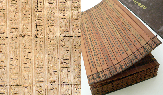
Incidentally I noticed recently that one of my favorite IT websites, which was just redesigned, has adopted a similar format for displaying headlines. And yes, I know they are called columns when used in this way, but visually, due to the modular packaging of the headline+anecdote that reads similar to a pictograph. Anyway, I find it to be one of the most visually pleasing and functional layouts that I've ever used. In summary, I intend to apply this technique to some of my own visual styles. While Egyptian culture was a colossal failure in many respects, it also contained a surprising level of contiguity, I find it a continual source of inspiration even to this day. If you follow my projects you will surly see the influence at some point. This is all relative to CMAP for a couple of reasons. First, because I decided to use hieroglyphs in my version tracking system (begrudgingly I have to cite the popular TV show LOST for refreshing my interest in dead languages), and second, because the written language used throughout neotoy (sen script) is of the Eastern school; although aside from the orientation there are few similarities. Sen is a 4th dimensional (time) language of exploring probabilities and attempts to communicate ideas holistically; giving the reader maximum latitude when interpreting its meaning. I try to compare it to a Choose Your Own Adventure book in language form. Hopefully I'll be able to ad an entry for this soon, as I already have a fair amount of info written up. 
Schema design for CMAP entries It's been awhile since I built an entire schema from the ground up. The nice thing about making schemas for "web design" is that it's so easy to prototype and deploy, especially if you're using flexible infrastructure. Personally I like to just use old-school HTML, although lately I've been experimenting with version 4.0. Which incidentally is a downgrade in many respects; adding a lot of pointless complexity for a slight increase in utility. 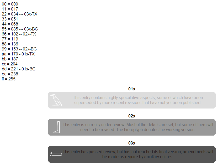
This project is an amalgam of generic web 2.0 styling and my own limited innovations. There are two parts to the schema-so-far, the 'notifications' - which are a banner type message space containing image and text elements. And the 'notes' which are just color coded entry versions arranged in a linear history. The first generation of the notifications used beveled corners and attempted to concisely mimic the industry standard i.e. google. But after further iterations I decided arbitrarily that 45 degree corners suited the overall site consistency better. I can think of plenty of pragmatic reasons to support this choice, i.e. no mathematical ambiguity or tonal gradation, easier to adapt to color changes, geometrically octagonal, is consequently more in-line with the digital medium. Still, when it comes right down to it, I find the harder lines to be more finite and expressive, which adds a subtle psychological value to the notification. I mention all this just because it reminded me of how much fun it can be to get creative with standards and potentially come up with something that looks or 'feels' even better than the original. I'll probably write more on this at a later date, because I find the creative process of mundane things to be of particular interest. Meanwhile feel free to check out my exceptionally crude CMAP template items entry.

tea-garden UPDATED So I've been a little slow getting started.. this is my first official entry into the CMAP since I drafted the new system. It's about tea-garden. Thursday seems to be a good day to do updates, but I can't guarantee that I'll be able to reliably put one out every week. TBH I found this one to be a lot more work that I had originally intended to put into it, even though it's not that long, or even very detailed. I also discovered that for every entry I draft I seem to create at least 2 additional dummy entries that need to be filled at a later date. Obviously if I keep that up this really will NEVER be completed. Oh well, maybe that's just part of the NC schema? After all it is a continuum. Anyway, I hope that at least a few of you enjoy this little side-note to Neotoy, since Jade is technically an extra-dimension. 

cmap UPDATED Just a minor update. I've modified my strategy for dealing with the connectivity map. I can't say that the new method is superior, but I think it does work a little better for me and my creative process. Instead of using a more holistic approach (like I'd like), I'm persuaded to focus on one article at a time. I hope to work out a practical schedule, tentatively I'm thinking 1 article per week, that seems attainable. At that rate, it might take three years to complete the continuum outline. Seems reasonable. 
Hello from the future Sticking with tradition, I made a few minor page design changes to 'celebrate' the new year, which isn't actually due until 10 days from now. TBH 2008 was not such a fantastic year and I'm kind of ready for it to be over. No, really it wasn't actually that bad, I'm being pointlessly dramatic just like this totally awesome iridescence-lined thunderhead.. 
Most likely I will be spending a lot less time debating sociopolitical trumpery, which is probably good news. Also I intend to stop posting links to other sites and articles, as if this were a blog, which it is most definitely not. My tentative plan is to steer this Titanic back on course over the next couple of months, bringing the bow back around where it belongs; headed dead-straight for Neotoy, full steam. The reasoning behind all this is pretty basic, there's not much doubt left in my mind that the original intuition was correct, our base model is broken and that's all there is to it. There's no point to pretending that it's salvageable any longer. Civilization will have to reconcile this situation on its own.. Assuming that such a thing ever existed (civilization). If our world reverts into an anarchy, and we lose this connection, I just want to thank you all for participating in my experiment. Hopefully you've learned as much as I have over the last 12 years. Given that a 12 year period is also the closest standard time approximation to a Neotoy cycle, this also constitutes my 1st neotopian anniversary. A date of some significance. Hope you all have an interesting 2009.. -neotoy |
|
|

|
|
|